 kangshida
What a Highlight Is in a Colored Contact Lens
A highlight is the brightest feature printed within the iris zone of a coloured contact lens. It imitates the small bright reflection that a real eye produces when light is reflected from the tear film and the front surface of the cornea — the same catchlight that appears in a photograph of a face. Because that reflection is one of the visual cues people read as “a living eye”, a lens without any highlight can look flat, while a lens with a poorly placed highlight looks printed.
The highlight is a separate design element from the two other structures that shape how a coloured lens reads:
- the graphic diameter, which is the width of the coloured zone and governs how much the iris appears enlarged;
- the limbal ring, a darker band at the outer edge of the coloured zone that imitates the natural darkening at the corneal limbus.
A highlight can be a single dot, a symmetric pair of dots, a short arc, a thin concentric ring, or a low-opacity scatter of small marks. It is usually printed in white or a pale neutral tone, but the tone, its opacity and its size all change the effect.

Why Highlight Positioning Matters
Colour is judged by the eye as a whole; position is judged feature by feature. Several practical consequences follow from that difference.
Position errors are more visible than colour errors. The highlight is the highest-contrast element in a coloured lens. A colour that is slightly cooler or warmer than expected rarely registers as a defect, but a highlight sitting in the wrong place, or sitting in a different place in each eye, is noticeable immediately.
The two eyes are read together. Wearers and observers compare left and right at the same time. When the highlight on one lens has rotated away from the other, the mismatch reads as asymmetry rather than as a design feature.
Position carries meaning. The position of a natural specular reflection tells the viewer where the light is coming from. A highlight placed in the conventional upper-temporal position reads as an ordinary daylight reflection; a highlight placed low in the iris reads as something printed rather than reflected.
Position interacts with the pupil. The pupil changes diameter with light, by a factor of several millimetres between a bright room and a dark one. A highlight placed very close to the pupil therefore appears to move relative to the pupil edge as the pupil dilates and constricts, which can make the design look less stable than it is.
Where the Highlight Sits: Position Variants
Designers describe highlight position in two ways: by clock position around the iris, and by distance from the pupil edge.
| Placement | Typical visual reading |
|---|---|
| Upper-temporal quadrant (around 1–2 o’clock) | A conventional daylight reflection. The most common single-highlight placement. |
| Upper-nasal quadrant (around 10–11 o’clock) | Softer and less directional; reads as diffuse incidental light. |
| Symmetric pair (around 10 and 2 o’clock) | A deliberate “sparkle” effect. Common in cosplay and special-effect designs; reads as cosmetic rather than natural. |
| Low or temporal placement | Unusual against a real eye; tends to read as a printed mark. |
| Thin concentric ring | Even illumination across the iris; the most rotation-tolerant of all variants. |
| Overlapping the pupil edge | The highlight partly disappears against the pupil; the effect weakens and the edge can look cut off. |
| Crossing the limbal ring | Reads as an error, because a real reflection never crosses the boundary of the eye. |
| Scattered low-opacity mesh | A diffuse “shimmer” rather than a defined catchlight; the effect survives rotation well. |
One anatomical detail is worth knowing when reading design documentation: the natural corneal reflection is usually not centred on the pupil. In most people it sits slightly toward the nasal side, which is why photographs of a face taken with a single light source show the catchlight offset in the same direction on both eyes. Designs that place the highlight at the geometric centre of the lens rather than at the position the reflection actually occupies tend to look mechanically centred.
How Highlight Position Changes the Visual Effect
Four variables move together: position, size, opacity and tone.
Size. A small highlight reads as a pin-point reflection. As it grows, it stops implying a light source and starts reading as a printed shape. The upper limit is roughly set by the size of a real reflection, which is small relative to the iris.
Opacity. Higher opacity produces a harder, brighter mark that reads strongly even in dim conditions. Lower opacity produces a subtler glint that is closer to the appearance of a reflection in diffuse light. High opacity combined with a large area is the combination most likely to look artificial.
Tone. Pure white is the strongest option. A slightly warm or slightly cool pale tone changes the perceived overall colour of the iris, because a highlight is read as part of the eye rather than as an addition to it.
Distance from the pupil and from the limbal ring. A highlight placed in the middle band of the iris — clear of the pupil, clear of the limbal ring — has the most space to work with and the least risk of being clipped by either boundary.
Design Considerations When Adjusting Highlight Position
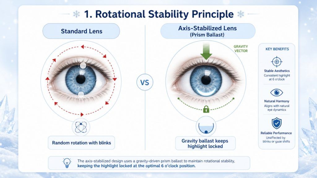
Rotation tolerance is the central problem. A soft lens does not necessarily sit in the same orientation it was printed in. Orientation on the eye is influenced by the base curve and diameter of the lens relative to the cornea, the forces applied by the upper and lower lids during a blink, the thickness profile of the lens, and any deliberate stabilisation feature such as prism ballast or thinned zones. Cosmetic lenses rarely carry stabilisation features, so the practical design answer is usually not “stop the lens rotating” but “make rotation visually harmless”.
There are three ways to do that:
- Radial symmetry. A pattern that repeats around the optical axis — a ring highlight, or a symmetric pair — still looks correct from any rotational position. This is the most robust approach and the least dependent on how an individual lens fits.
- A rotation-tolerant asymmetric design. A single highlight can be placed where the pattern degrades gracefully, for example by widening it or softening its edge so that the loss of positional accuracy is not visually obvious.
- Stabilisation. Where a specific orientation genuinely matters, a lens can be given orientation features of the kind used for toric correction. This adds design and manufacturing complexity, and the stabilising geometry competes with comfort and thickness considerations.
The optical zone must stay clear. The central area of the lens through which light is focused must remain free of pigment. A highlight therefore has to be positioned outside the optical zone; designs that place it too far toward the centre compromise vision rather than merely looking wrong.
Pigment loading has physical consequences. Higher-opacity pigment adds material in a defined region, which affects local thickness, and in a coloured lens it also affects how much oxygen passes through that area relative to the clear zone. This is one of the reasons that heavy, saturated highlight designs are generally avoided in lenses intended for longer wearing schedules.
Consistency across a range matters more than the absolute design. Where a product is offered in many powers and base curves, the highlight should read the same way across the range. A highlight that looks balanced at one power but sits differently at another creates the impression of an inconsistent product.
How Highlight Positioning Reads on Different Eye Shapes
The visible iris diameter, the pupil size in ordinary light, and the size of the palpebral aperture (the opening between the eyelids) all vary between individuals. The same lens design therefore does not read identically on everyone.
- Dark irises. A bright, high-opacity highlight is much more visible against a dark background. On a dark brown iris the contrast is at its highest, so a highlight that looks delicate in a design mock-up can read as a distinct white dot on the eye.
- Light irises. The reverse problem: the iris itself already contains variations in brightness, and a strong highlight can look excessive or artificial. Lower-opacity highlights tend to work better here.
- Narrow palpebral aperture. Where the upper lid covers the upper part of the iris, an upper-positioned highlight is partly hidden most of the time. This is one reason symmetric pairs or a ring highlight can read more consistently than a single high-placed dot.
- Large visible iris. A highlight occupies a smaller proportion of a large iris, so it reads more subtly; the same design on a smaller iris is proportionally larger and more prominent.
- High prescriptions. Where the optical zone of the lens is necessarily larger or where the lens is thicker toward the edge, the available iris band for printing narrows, which limits how far a highlight can be placed from the pupil.
Common Design Approaches in the Industry
- Single upper-temporal dot. The most common arrangement, chosen because it matches where a reflection usually falls in a normal indoor or daylight environment.
- Symmetric pair. Used where a stronger, more decorative effect is wanted, and where rotation tolerance is a priority.
- Thin ring. Chosen for even, non-directional illumination, and for the fact that a ring is unaffected by any rotation of the lens.
- Low-opacity scatter or mesh. Produces a soft glint instead of a defined mark; the approach least sensitive to positional accuracy.
- Stabilised asymmetric design. Applied where a specific highlight position is essential and the extra design complexity is justified.
- Multi-layer printing. Where the highlight is built up in more than one printed pass, which allows softer edges and graduated opacity, at the cost of additional process steps.
Common Misconceptions
“A highlight is just a white dot.” Size, opacity, tone, edge softness and distance from both the pupil and the limbal ring each change the outcome. Two lenses that both “have a highlight” can look entirely different.
“A bigger highlight looks more natural.” The opposite is closer to the truth. Real reflections are small; a large highlight stops reading as a reflection.
“The highlight is what makes the eye look bigger.” Eye enlargement is governed by the graphic diameter and the limbal ring. The highlight affects liveliness and realism, not apparent size.
“Stable means the lens cannot rotate.” In practice, stability means either that rotation does not occur in normal use, or that when it does occur the design still reads correctly.
“The highlight pigment is exposed to the eye.” In lenses built with an encapsulated pigment layer, the colourant, including the highlight, is held within the lens structure rather than on the outer surface. Construction methods are covered separately in Pigment Encapsulation in Colored Contact Lenses.
FAQ
- Does a highlight affect vision?
It should not. The highlight is positioned outside the optical zone, the central area that focuses light. Where pigment is placed inside the optical zone, vision can be affected, and this is avoided by design.
- Why does my highlight look off-centre?
The most common reasons are rotation of the lens on the eye, a base curve or diameter that does not match the cornea closely, or a design whose highlight sits at the geometric centre of the lens rather than at an anatomically plausible position.
- Is the highlight visible in low light?
Yes, and the effect changes. In dim light the pupil dilates, which shifts the relationship between the highlight and the pupil edge. A highlight placed close to the pupil can appear to drift outward in dark conditions.
- Do all coloured contact lenses have a highlight?
No. Many designs rely only on colour, a graphic diameter and a limbal ring. A highlight is an optional element chosen for a particular look.
- Can the position of a highlight be changed on an existing design?
Position is part of the printing design, so changing it requires a new design and a new print set-up. It is a design change, not an adjustable setting.
- Does a highlight work on very dark eyes?
It is most visible on very dark eyes, which is also why the risk of it looking artificial is highest there. Lower opacity and a smaller area are usually used to compensate.
- Do both eyes need the same highlight?
They should read the same. Because the two eyes are compared directly, a mismatch between left and right is more noticeable than a difference from the intended design.
Related Terms
graphic diameter · limbal ring · colour blending · optical zone · opacity · lens rotation and orientation · prism ballast · pigment encapsulation · base curve · visible iris diameter