
What “Natural Aesthetics” Means in Colored Lenses
“Natural aesthetics” describes a design goal rather than a colour: the lens should be read as the wearer’s own eye rather than as a visible product on the eye. Consumers sometimes compress this into the phrase “my eyes but better”, which is a marketing expression rather than a technical one, but it captures the intent accurately — the effect should be noticed as an impression, not identified as an object.
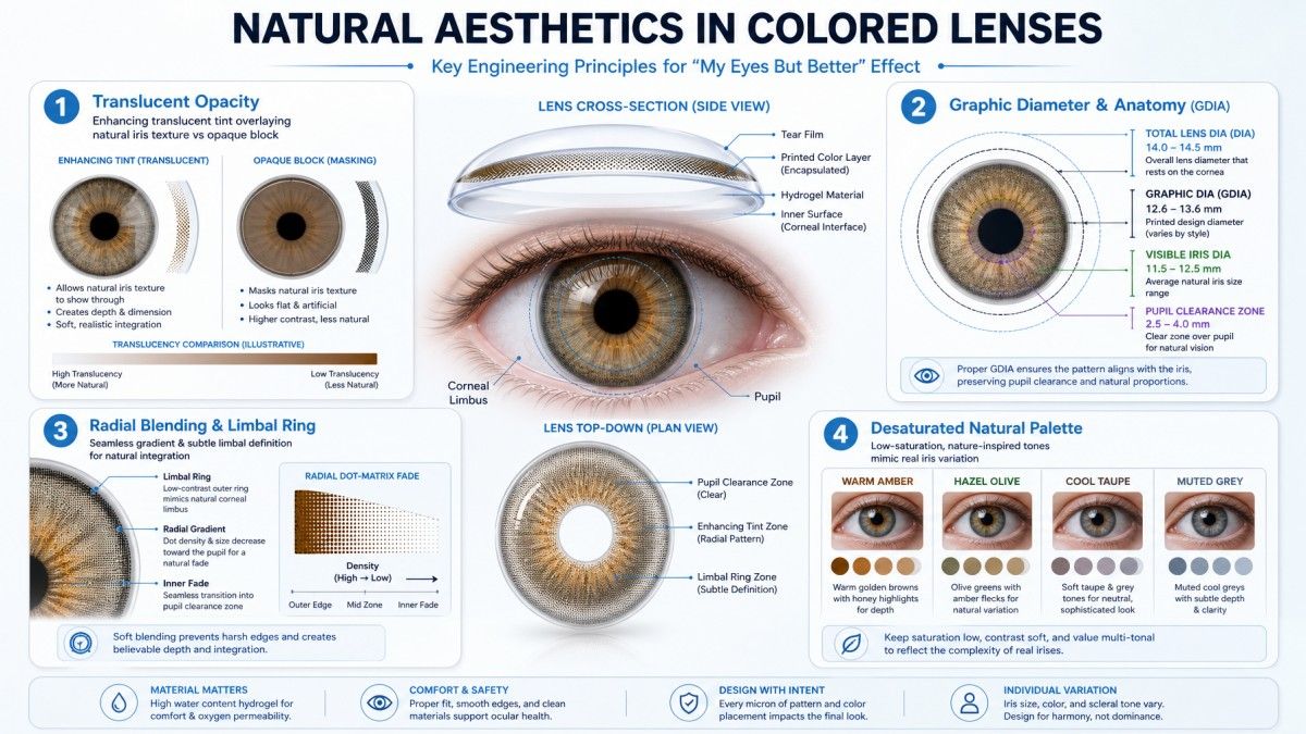
In practice, a lens achieves that impression through four design decisions working together: how much of the natural iris is covered, how opaque the colour is, how the printed colour blends at its edges, and how the coloured zone is sized relative to the iris. Change any one of them and the lens stops reading as natural, even if the colour itself has not changed.
The Shift Away From High-Opacity Colour
The clearest directional change in colour design over recent years is a move away from high-opacity, fully covering colour.
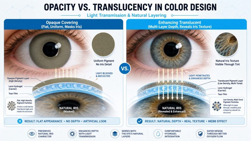
- Opaque (covering) colour replaces the natural iris pattern entirely. It produces the strongest colour change and the most uniform result, and because it hides what is underneath, it reads the same way on every wearer.
- Enhancing (translucent) colour is printed at low opacity over the natural iris. It intensifies or shifts the existing colour while leaving the iris pattern visible underneath. The result is different on every eye, because part of the appearance is the wearer’s own.
High-opacity designs have not disappeared — they remain the basis of dramatic, cosplay and special-effect products, where the intent is explicitly a visible change. What has changed is their position in the market: what was once the default look for coloured lenses is now a deliberate style choice, while the everyday segment has shifted toward lower opacity.
The reasons are practical as much as aesthetic. Low-opacity colour is more forgiving of small differences in base colour between wearers, it tolerates a wider range of lighting, and because less pigment is used, it places fewer demands on the construction that holds the pigment in place.
Graphic Diameter and Perceived Naturalness
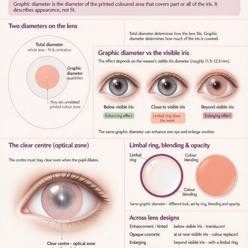
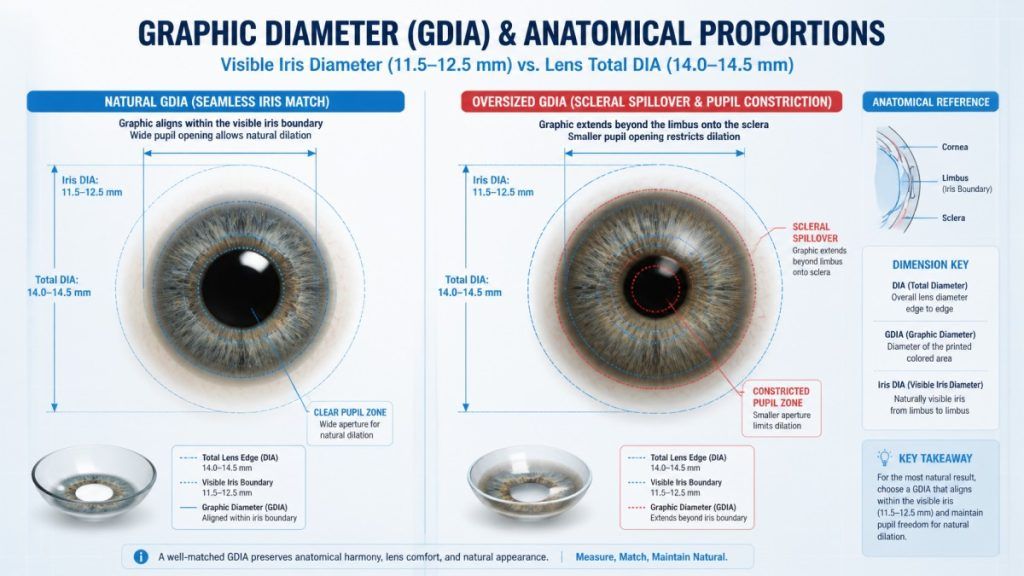
Graphic diameter is the width of the coloured zone. It is always smaller than the total diameter of the lens, and the difference is taken up by the clear peripheral area that forms the optical and handling zone.
Two reference points frame every decision here:
- The visible iris diameter in adults is commonly quoted in the region of 11.5 to 12.5 mm, with reported ranges varying between populations.
- Coloured soft lenses are commonly offered with total diameters in the region of 14.0 to 14.5 mm.
A coloured lens creates the impression of a larger iris whenever the graphic diameter approaches or exceeds the wearer’s own visible iris diameter, because the lens extends the coloured area over part of the sclera that would otherwise be white. That is the mechanism behind “enlarging” styles, and it is also the mechanism that makes a design read as unnatural: the eye appears to have grown beyond its anatomical boundary, and observers register the mismatch even when they cannot name it.
The design consequence is that graphic diameter, not colour, is the primary control on how natural a coloured lens looks. A modest colour change applied at a graphic diameter the wearer’s iris can plausibly support usually reads as natural. A subtle colour applied at an oversized graphic diameter does not.
Graphic diameter also interacts with the pupil. Because the coloured zone surrounds the pupil, a lens with a large graphic diameter and a small clear pupil zone leaves less margin for the pupil as it dilates in low light, and a pupil that approaches the printed edge makes the design read as makeup rather than as iris.
Colour Blending and Limbal Ring Design
Two structures determine how the colour meets the rest of the eye.
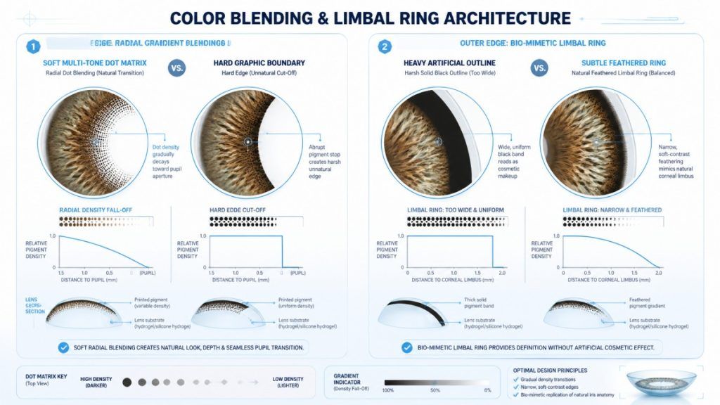
Colour blending is the treatment of the inner edge of the coloured zone — the boundary between the printed colour and the pupil, and between different tones inside the pattern.
- A hard edge produces a defined, graphic boundary. It reads as deliberate and dramatic.
- A soft or radial edge, where opacity falls off gradually, reproduces the way pigment density varies in a natural iris. It is the single most effective technique for making a printed pattern read as a natural iris, because real irises have no crisp internal boundary.
Multi-tone printing builds colour from several translucent passes rather than one opaque layer, which is what allows a graduated effect. Each additional pass adds process complexity and inspection criteria.
The limbal ring is a darker band at the outer edge of the coloured zone, reproducing the natural darkening at the corneal limbus, where the iris meets the sclera. Its design logic is straightforward: a defined outer boundary helps the coloured area read as a complete iris rather than as a printed circle.
The ring’s strength is a trade-off. A ring that is too faint leaves the coloured zone with an unresolved edge. A ring that is too dark or too wide reads as an outline, because it is thicker and more uniform than the natural limbus. Most natural-look designs use a ring that is narrower and lower in contrast than the maximum the pattern could carry.
Colour Families That Read as Natural
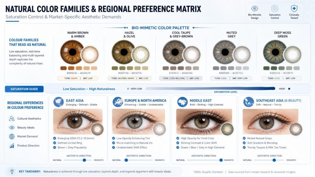
The colour families most often used where a natural effect is the goal share a property: they sit close to the tones human irises actually contain.
- Warm browns and ambers — the closest match to the most common natural iris colour, and the most forgiving across skin tones.
- Hazel and olive tones — brown with a green or gold cast, reproducing the two-tone variation common in hazel irises.
- Grey-brown and cool taupes — a desaturated brown with a cool cast, used for a softer, lower-contrast result.
- Muted greys — most effective on eyes that already have some light in them; on very dark irises a grey overlay reads as an applied colour.
- Deep greens and moss — used at low opacity for a green cast over a brown base.
The common factor is saturation. Natural irises are relatively low in saturation and vary in brightness, so high-saturation colour reads as cosmetic regardless of hue. Hue decides which direction the change takes; saturation and opacity decide whether it stays believable.
Regional Differences in Colour Preference
Colour preference varies by market, and it is worth being explicit about the quality of the evidence: the differences below are widely described by industry participants and in trade coverage, and they are qualitative observations rather than measured segment data. Preference also varies substantially within every market.
- East Asia. Widely associated with defined limbal rings, larger graphic diameters and grey or brown tones marketed for an enlarging effect. The pattern libraries developed for this market have influenced product ranges elsewhere.
- Europe and North America. Widely associated with lower-opacity enhancement, smaller graphic diameters and closer colour matching, with a preference for a change that is difficult to identify as a product.
- Middle East. Widely associated with higher-opacity colour and more pronounced change, reflecting a preference for a visible result.
- Southeast Asia and other markets influenced by K-beauty trends. Widely associated with grey and muted natural tones alongside decorative styles, often moving faster than established markets because social platforms accelerate trend diffusion.
Treat these as directional. A distributor’s actual sales mix is the only reliable indicator for a specific market, and pattern libraries accordingly carry a wide spread rather than a single style.
How Trends Move Through the Market
Colour trends in this category move through a chain that is longer than it looks from the consumer side.
- Aesthetic influence. Beauty trends, fashion seasons and social content originate the demand signal. Regional trends spread across borders faster than they used to, largely through short-form video.
- Pattern development. A new colour concept becomes a printed design: tone passes, blending treatment, graphic diameter and limbal ring. This is design work, and it is iterative because a pattern reads differently on the eye than in a design file.
- Tooling and print set-up. Each new colourway requires print set-up before it can be produced, and the tooling step sits between a design decision and a saleable product.
- Range decision. A manufacturer’s or brand’s range is assembled from patterns against expected demand by market. Breadth costs money, so the range is a commercial judgement about which trends will persist.
- Feedback and retirement. Sell-through in each market feeds the next range decision. Styles that do not persist are retired from the range, which is why a colour available this year may not be next year even though the technology has not changed.
The practical consequence for anyone reading trend coverage: the trend described in consumer media is at the beginning of this chain, while the product on a shelf is at the end of it. The interval between them is measured in seasons, and styles that appear to arrive suddenly have usually been in pattern libraries for some time.
FAQ
What makes a coloured lens look natural? Saturation and opacity matter more than hue, and graphic diameter matters more than either. A low-opacity, low-saturation colour applied at a graphic diameter close to the wearer’s own visible iris diameter is the combination that reads as natural most consistently.
Is a bigger graphic diameter the same as a bigger eye? It produces the impression of a larger iris by colouring part of the area outside the natural iris boundary. Past a certain point the effect stops reading as an eye and starts reading as a lens, which is the limit that natural-look designs work within.
Why do some coloured lenses look identical on everyone while others do not? Opaque colour covers the natural iris, so the result is largely determined by the lens. Translucent colour interacts with the iris underneath, so the same lens produces a different result on different eyes.
What does “my eyes but better” mean technically? Nothing specific. It is a consumer expression for a low-opacity enhancement designed to be read as the natural eye rather than as a product.
Is a strong limbal ring a good idea for a natural look? It adds definition, but a ring that is too dark, too wide or too uniform reads as an outline. Natural-look designs generally use less contrast than the pattern could carry.
Do these preferences apply everywhere? No. Regional preference varies widely and is described here qualitatively. Actual demand should be read from each market’s own sales mix.
Why does a colour I liked disappear from the range? Range decisions are commercial. A colourway that does not sustain sell-through is retired even though nothing about the manufacturing technology has changed.
Are coloured non-corrective lenses regulated? Yes, in the European Union they are treated as products without an intended medical purpose under Annex XVI of Regulation (EU) 2017/745 and are subject to the common specifications in Commission Implementing Regulation (EU) 2022/2346, with classification guidance in MDCG 2023-5. In the United States all contact lenses, including decorative lenses, are regulated as medical devices and require a prescription.
Related Terms
graphic diameter · visible iris diameter · limbal ring · limbal ring design · colour blending · opacity and translucency · enhancing tint · opaque tint · highlight positioning · saturations and tone · pattern library
Sources and References
Regulation and official guidance
- Regulation (EU) 2017/745 on medical devices (MDR), Annex XVI
- Commission Implementing Regulation (EU) 2022/2346 — common specifications for Annex XVI products
- MDCG 2023-5, Guidance on qualification and classification of Annex XVI products — https://health.ec.europa.eu/document/download/ea4acf26-979a-4dbb-92ff-8d1d804da51a_en?filename=mdcg_2023-5_en.pdf
- US Food and Drug Administration, Decorative contact lenses — https://www.fda.gov/medical-devices/contact-lenses/decorative-contact-lenses-halloween-and-more
Market data (third-party commercial estimate — segment growth only; see the note on scope below)
- The Business Research Company, Coloured Contact Lenses Global Market Report — https://www.thebusinessresearchcompany.com/report/coloured-contact-lenses-global-market-report